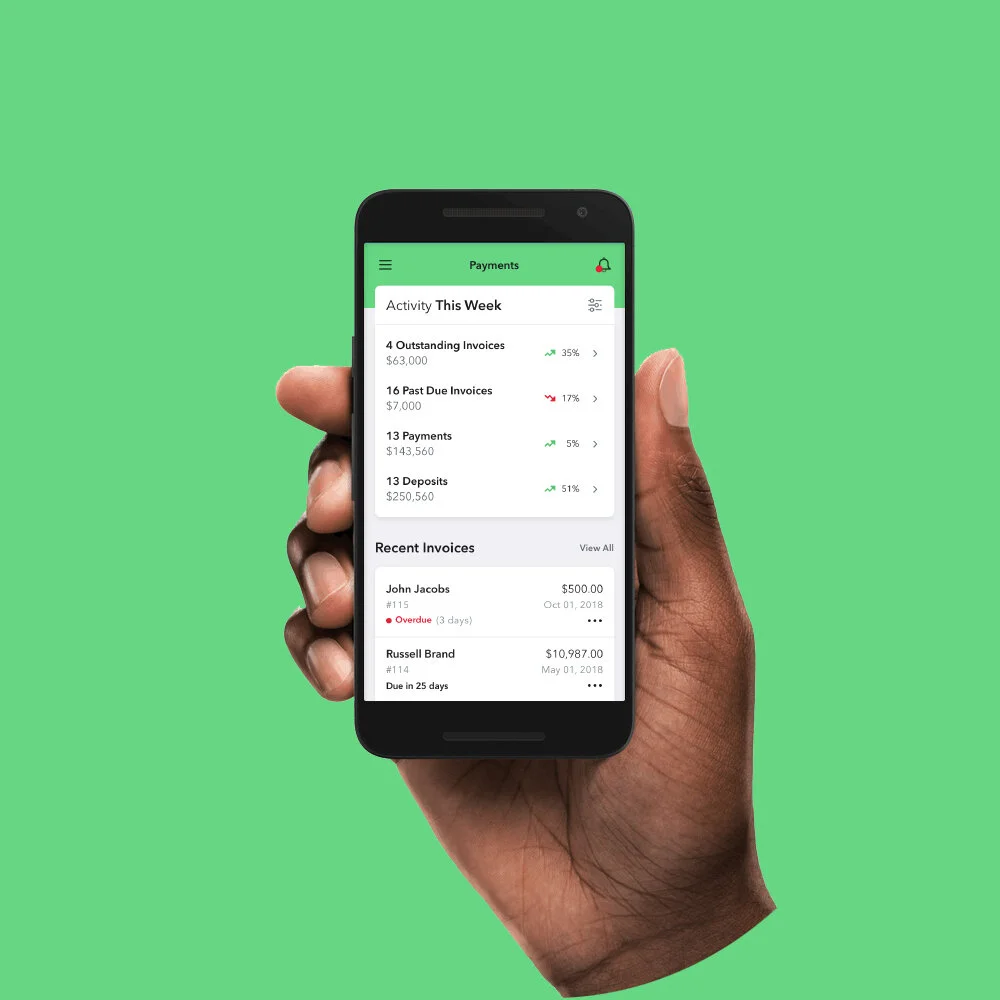
Kabbage Payments
Redesigning the way service-based merchants bill their customers.
Problem
Kabbage set a goal to build a suite of products that give business owners a holistic view of their business, while allowing them to easily manage it. Because one of our key demographics was service-based merchants, our team set out to build an invoicing tool that not only met their needs but surpassed all expectations.
Our first step was to reach out to service-based merchants already using Kabbage and understand not only what methods they used, but what needs were not being met.

User research
We segmented our user research into 2 main processes: contextual inquiry and competitive analysis.
Contextual inquiry
We first put together a conversation guide to give structure to the interview process. With that in place, we spent a week speaking directly with current Kabbage lending customers that used an invoicing tool. After the interview process was over, we came together as a team and synthesized our notes. In the synthesis process, we developed personas and broke down the customers’ needs. We could then decipher overarching must-haves and friction points.
Customer feedback:
“I run the business and manage the finances, so it’s very important to know when I’ve been paid, or if someone still owes me money.”
“I love my current product, it’s so easy to navigate”
“My customers are recurring, so I need a way to automate my invoices.”
Competitive analysis
We knew it would be crucial to understand what our competitors offered, as well as where we could exceed market parity. We started out by making accounts for every competitor in the digital invoicing world, printing them out, and placing them on the wall. We looked at holistic approaches to the product as well as how each feature within the product was handled. This would also help our efficiency; some features just don’t warrant reinventing the wheel.
Alignment
After establishing customer needs and feature parity, we created a list of ‘How might we…’ questions to help us better align our user’s tasks and goals:
How might we provide an engaging, valuable experience?
How might we allow users to access their most critical business information through web and mobile devices?
How might we provide a tailored experience that allows users to see what’s most important to them?
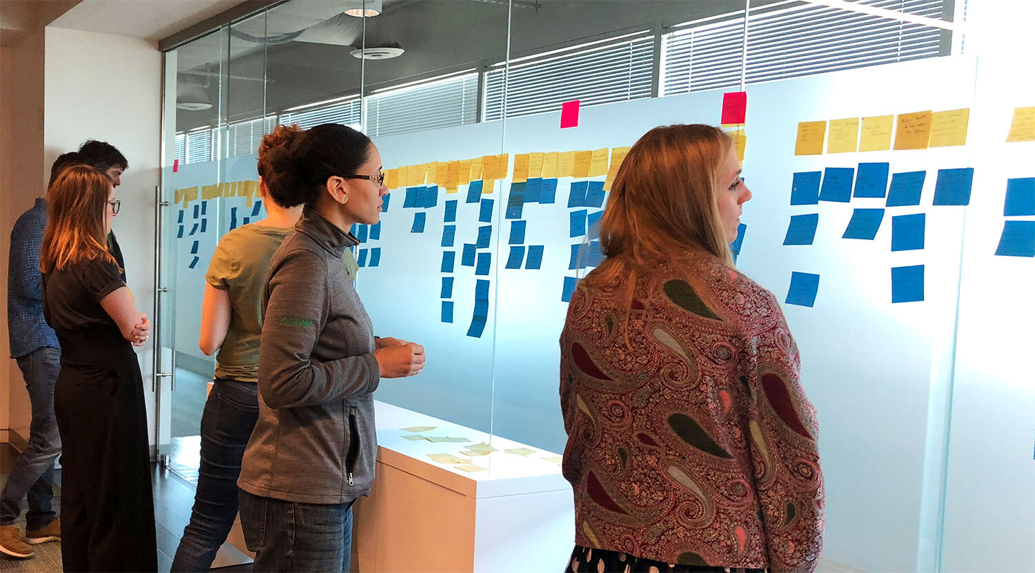
From there we ran a card sorting session with product managers and developers to determine overall hierarchy and priority of all the features for our MVP. After we established a structure and earned stakeholder buy-in, UX built a product feature map along with user flows to determine potential interaction and feature connections. This allowed product managers to easily develop a product roadmap and allow the entire team to align on product vision.

MVP
As I began building out streamlined versions of the core features—sales, customers, items, etc.—I wanted to make sure I was thinking about the aggregation of data that would be displayed on the user’s dashboard.
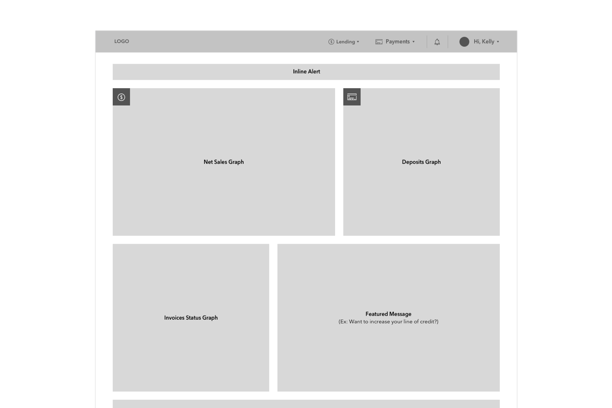
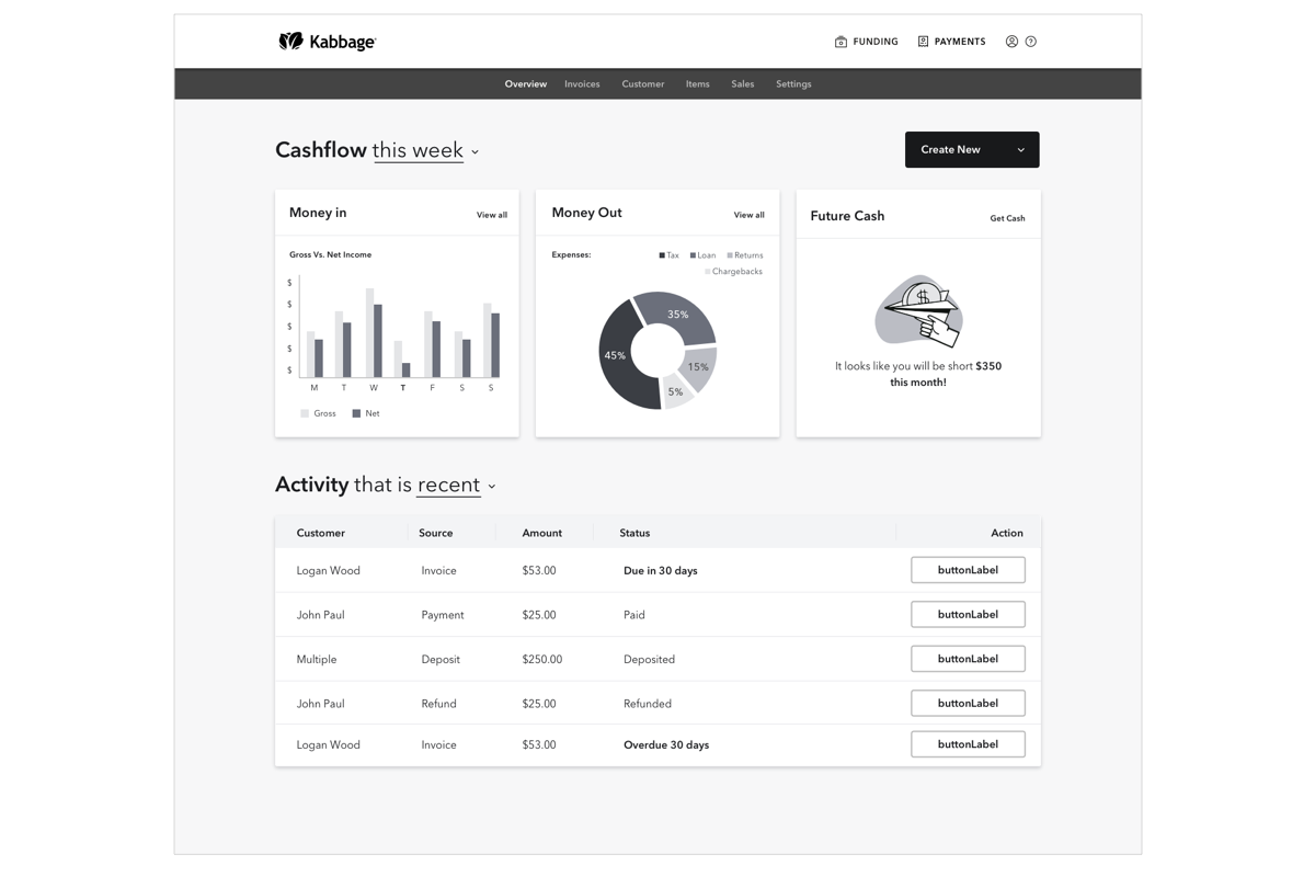
To start validating our assumption about dashboard functionality, I designed a screen to display high-level insights for the users (net sales, deposits, invoice statues, etc.). We then ran user-testing sessions to get direct feedback from customers.
Customer feedback:
“If I want graphs about a specific thing, I’d expect to go to that page in the product. I just want to know what I should be taking action on or if I’ve been paid.”
“...too much information”
We quickly realized that we put too much information on the dashboard: If users wanted massive graphs, they’d go to a specific feature for that insight. Users felt like the dashboard was there to notify them if there was something they needed to take action on, or if they had been paid recently for a pending invoice. We continued this validation phase until user feedback was overwhelmingly positive.
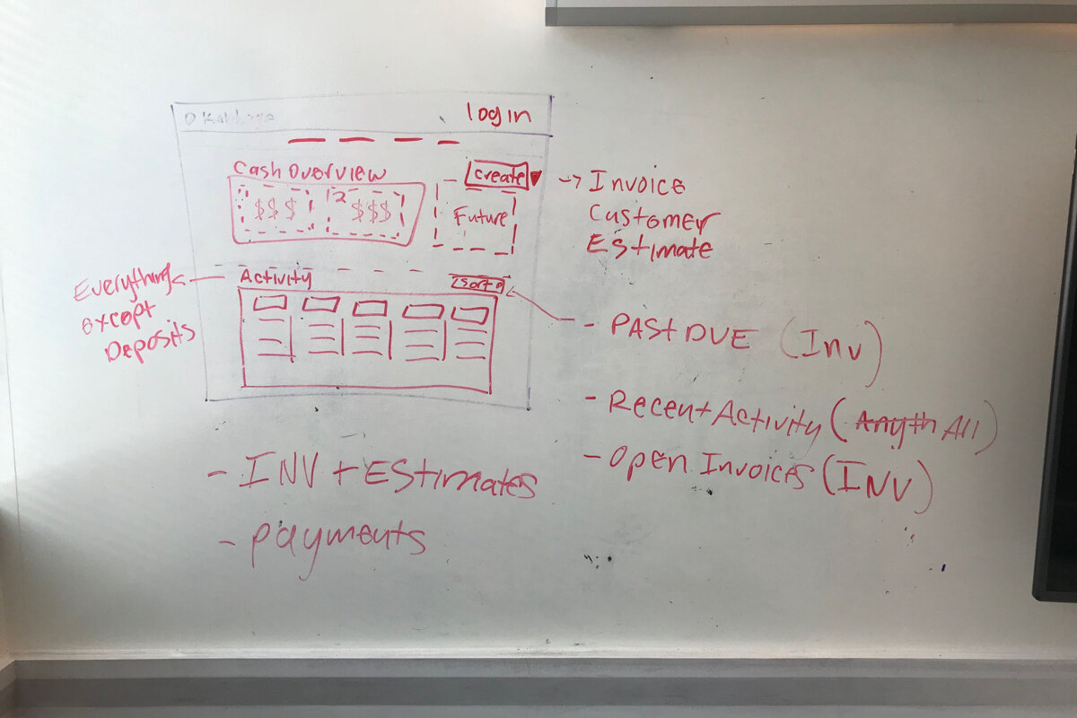
Dashboard process work:
Challenge
Unfortunately, one of our main challenges was our lack of resources, which is generally the case when building a product from the ground up. There was a ton of backend work that needed to be done and our product had to be lean. But of course, finding ways to provide value to users remained paramount:
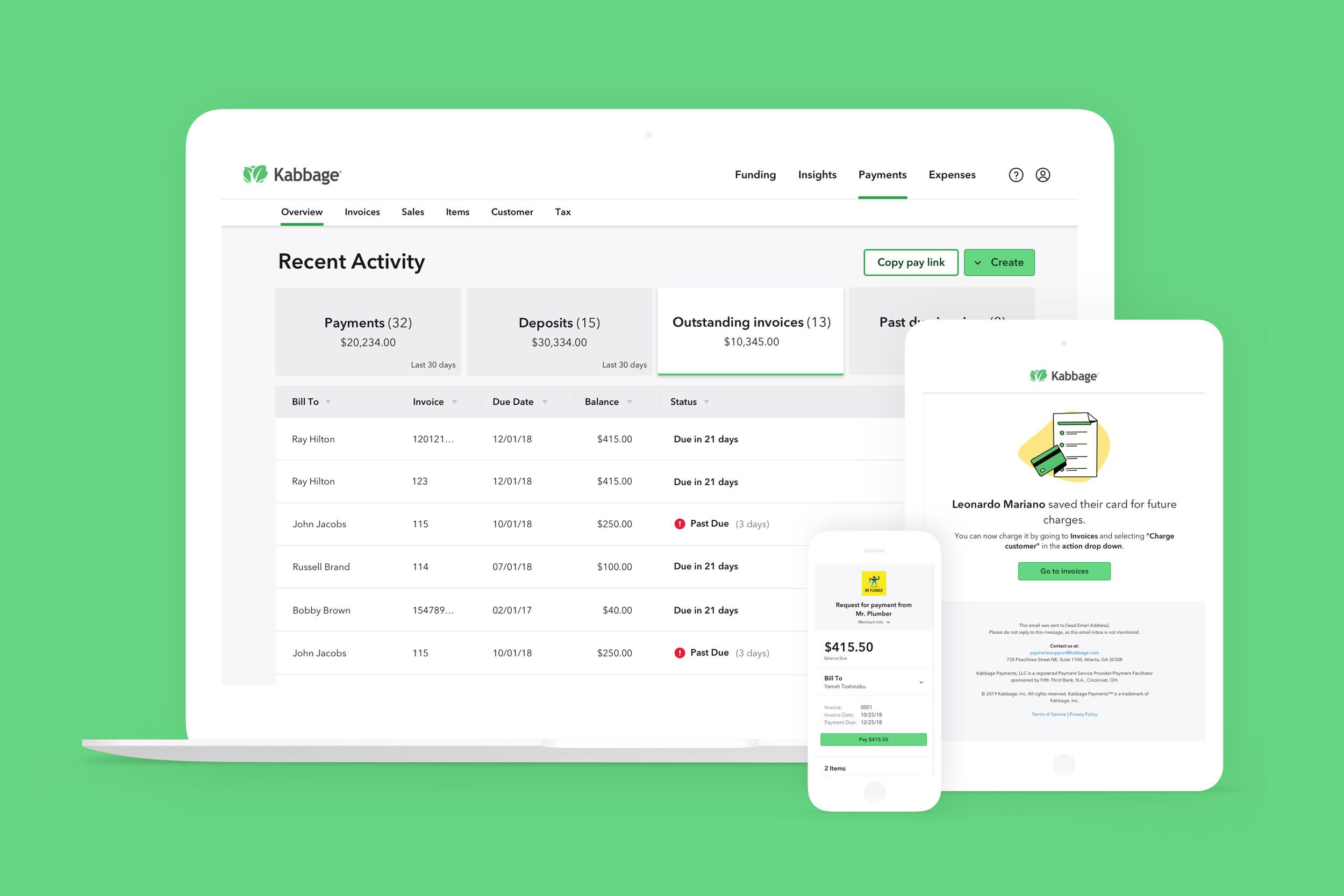
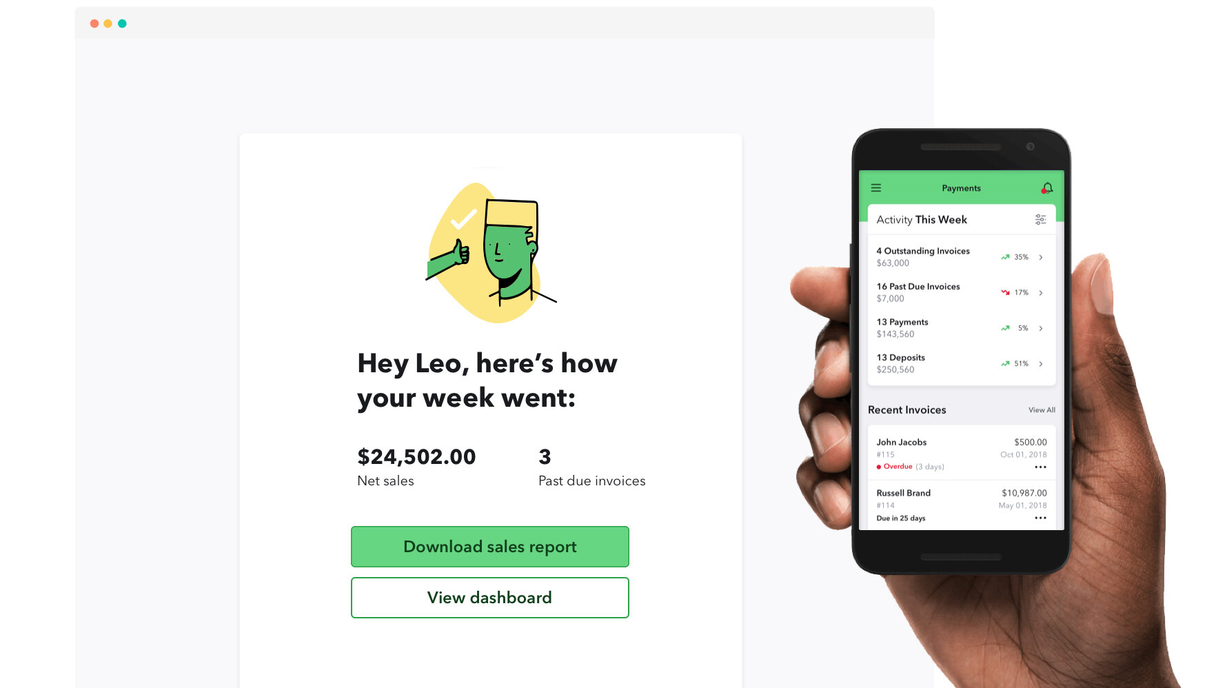
I scoped down the dashboard to a tab system, pulling in the 4 main actionable lists. This would allow users to quickly see when they were last paid and take action on past due invoices.
We still had plans for in-app notifications, but it needed to be deprioritized since this would require a heavy lift from our developers. We were able to transform this into a post-event email summarizing when a user was paid, as well as weekly net sales.
Next steps
The released version of the invoicing tool has been well received by our customers. However, there are still improvements that can be made. For example, a user should be able to send recurring invoices and allow their customers to save their cards on file.